As a website owner, you may have heard the term "above the fold" in the context of website design and SEO. But what does it mean, and why is it important for your website's search engine rankings?
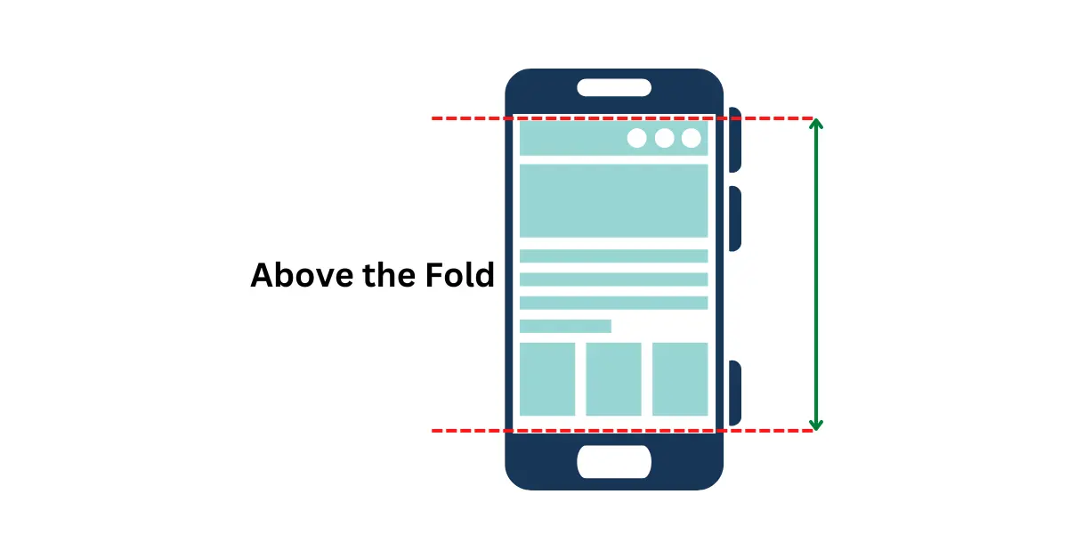
When it comes to designing a website, one of the most crucial aspects to consider is the fold content. This term refers to the part of a webpage that is immediately visible to a user when they land on a website, without the need to scroll.
Above-the-fold content is important because it can impact a user's first impression of a website and determine whether they continue to engage with it or not. In this article, we will dive into the importance of above the fold content, its historical background, user management techniques, how to determine the visible range, best practices for content placement, and more.
The Origins of the Term 'Above the Fold'

The term 'above the fold' originated from the newspaper industry, where it referred to the upper half of the front page that was visible when the newspaper was folded in half. The importance of above the fold content in newspapers was clear, as it determined whether a potential reader would pick up the newspaper or not.
In modern times, above the fold content has become equally important in the digital world. As users increasingly prefer to browse the internet on mobile devices, it is critical to ensure that the content they see immediately upon landing on a website is relevant, engaging, and attractive.
Above the Fold from an SEO Perspective
Optimizing above the fold content is not only important for user engagement but also for SEO. Effective use of above the fold content can help to increase click-through rates and reduce bounce rates, both of which can positively impact search engine rankings.
User Management Techniques
To optimize above the fold content, it is crucial to understand user behavior and psychology. User management techniques such as visual hierarchy, clear and concise messaging, and effective use of whitespace can help to manage user attention and guide their focus to the most important elements on the webpage.
It is also important to consider user experience when designing above the fold content. For example, if a webpage takes too long to load or if the content is cluttered and overwhelming, users are more likely to navigate away from the site and look for alternative options.
How to Determine the Visible Range
To determine the visible range of a webpage, it is important to understand the screen size of the target audience. This can be achieved by analyzing the device usage data of the website's current visitors or by conducting user surveys to determine the most common screen sizes.
Tools such as Google's Browser Size and Screenfly can also be used to simulate the viewport of different devices and provide a better understanding of what is visible above the fold.
Best practices for determining visible range include ensuring that critical information such as headlines, calls to action, and important images are visible on all screen sizes.
Online Tools for Defining Above the Fold
- Screenfly: A free online tool that allows you to see how your website looks on different devices and screen sizes.
- BrowserStack: A cross-browser testing tool that lets you test your website on various devices and browsers.
- Viewport Resizer: This tool lets you test how your website looks on different screen sizes. You can adjust the size of the viewport to see which elements are visible above the fold.
- Responsive Design Checker: This tool helps you test the responsiveness of your website on different devices. You can view your website on various screen sizes to determine which elements are visible above the fold.
- Google Analytics: This tool can help you analyze your website's performance and see which pages are getting the most views. You can use this information to determine which elements are above the fold and which ones are below.
Above and Below the Fold: Which Content Belongs Where?
Deciding where to place your content, whether above or below the fold, can be a challenging task. While above the fold content is considered more important, it is essential to understand that not all content needs to be above the fold.
Factors to consider when deciding where content should be placed include:
- The importance of the content
- The user's needs and expectations
- The length and format of the content
- The user's browsing behavior.
Best practices for content placement include:
- Placing critical information and call to action above the fold
- Ensuring that the content below the fold is still visible and accessible
- Considering the context of the content and the user's needs.
Examples of effective content placement include:
- Websites that use clear headings to guide users to the information they need
- Websites that use visual elements to draw attention to important content.
Above the Fold Website Design Best Practices
One of the best practices for designing above the fold content is to create a visually appealing design that captures the user's attention. This can be achieved by using a color scheme that complements the brand and including high-quality images that support the content.
Additionally, it's crucial to create a clear hierarchy of information, starting with the most important content at the top. This can be achieved through the use of headlines, subheadings, and bullet points. Also, make sure that the content is easy to read and that the font size is legible for all users.
Examples of effective above the fold website design
To see examples of effective above the fold website design, we can look at websites like Apple, which uses a clean and minimalist design that captures the user's attention. Additionally, the website has a clear hierarchy of information, starting with the most important content at the top.
Above the Fold Content Examples to Inspire Your Own
When it comes to creating above the fold content, it's helpful to look at other websites for inspiration. Here are some examples of websites with effective above the fold content, along with an explanation of what makes them effective.
Examples of websites with effective above the fold content
Dropbox

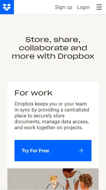
Dropbox uses a clear and concise headline that tells the user what the website does. Additionally, the website has a strong call to action that encourages users to sign up for the service.
HubSpot

HubSpot uses a visually appealing design that captures the user's attention. Additionally, the website has a clear hierarchy of information, starting with the most important content at the top.
Trello

Trello uses a clean and simple design that emphasizes the product's features. The website's headline is clear and concise, telling the user what the product does, and the call to action is prominent and encourages users to sign up for the service.


